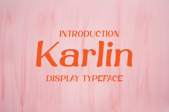
Karlin: A Display Font That Elevates Digital Headlines
Two weeks ago, I was finalizing the hero section of a boutique online store’s homepage—clean layout, soft pastel palette, lifestyle photography—and something felt off. The headline typeface lacked presence. It was legible, sure, but it didn’t *land*. Not emotionally. Not visually. So I swapped in Karlin, previewed it at 48px on desktop and 36px on mobile, and instantly felt the shift: warmth, intention, quiet confidence. Karlin isn’t just another decorative font—it’s a display font with rhythm, personality, and surprising versatility for digital interfaces.
Karlin has that rare balance: playful without being childish, elegant without feeling stiff. Its letterforms carry subtle contrast—gentle curves meet confident strokes, with open counters and generous x-heights that support readability even at smaller display sizes. It leans modern but avoids cold minimalism; there’s humanity in its proportions, like handwriting refined through careful design. As a display font, it’s built to command attention—not whisper, but invite.
In practice, I used Karlin for three key areas on that boutique site: the main hero headline (“Handcrafted Ceramics, Thoughtfully Made”), the “New Arrivals” section banner, and the CTA button text (“Shop the Collection”). Each use reinforced how well it performs in high-impact, short-form contexts. On the hero, it anchored the visual hierarchy without competing with the imagery. Over a softly blurred background, its contrast held up beautifully—even on light mode with a semi-transparent overlay. No stroke effects or shadows needed.
That said, Karlin shines brightest where brevity meets intention. It’s ideal for headlines, section titles, call-to-action buttons, logo lockups (especially for creative brands), and social media banners—but not for body copy, navigation labels, or form fields. Its charm lies in restraint. Try using it for a coaching website’s tagline (“Clarity Starts Here”), a course sales page’s benefit-driven header (“Build Your First Portfolio in 5 Weeks”), or a portfolio homepage’s name treatment. In each case, Karlin adds tonal clarity before the user reads a single word.
Readability on mobile was a pleasant surprise. At 32px on iOS Safari and Chrome Android, Karlin remained crisp and legible—even with modest line spacing. I tested it over both light and dark backgrounds, and while it performs best on light or mid-tone surfaces, it holds up cleanly on deep charcoal when paired with sufficient letter-spacing (+0.5px) and ample padding. Avoid ultra-thin weights on small screens; the standard weight delivers the strongest legibility across devices.
Font pairing is where Karlin truly unlocks its potential. I paired it with Inter (a highly readable, open-source sans serif) for all body text, captions, and interface labels. The contrast worked beautifully: Karlin brought character and brand voice; Inter delivered neutrality, speed, and accessibility. For a more editorial feel—say, on a blog redesign or digital magazine landing page—I’d consider pairing Karlin with a warm, low-contrast serif like IBM Plex Serif or Charter. The key is balance: one expressive voice for impact, one grounded voice for function.
Before deploying Karlin in production, I checked what was included. It ships with webfont files (WOFF2 recommended for performance), multiple weights (Light, Regular, Medium, Bold), and stylistic alternates—like swash capitals and contextual ligatures—that add polish to hero text or logo variations. It supports Latin-based languages and includes basic diacritics, which covered the client’s needs (English + French product names). Licensing was straightforward: a commercial license covers websites, SaaS dashboards, digital templates, and client projects—no hidden restrictions or per-page fees.
One thing I appreciated during implementation? How smoothly it integrated into our existing CSS architecture. We loaded it via a self-hosted font stack (no third-party DNS delays), declared fallbacks responsibly (font-family: "Karlin", -apple-system, BlinkMacSystemFont, "Segoe UI", sans-serif;), and applied it only where it added value—not as a blanket replacement. That discipline kept load times low and ensured typography served the experience, not the other way around.
I’ve seen designers reach for script fonts or ultra-thin serifs when they want “personality,” but those often sacrifice scanability or fail on touch targets. Karlin avoids that trap. Its letterforms are distinct enough for quick recognition, even in fast-scrolling contexts. On a campaign landing page, users paused longer on headlines set in Karlin—less because it slowed them down, more because it felt intentional, curated, trustworthy. That subtle psychological lift matters: typography shapes perception before content does.
It’s also worth noting where Karlin doesn’t belong. Don’t force it into navigation menus, pricing tables, or error messages. Skip it for long paragraphs, data-heavy dashboards, or forms requiring high cognitive ease. And while it works well in SVG-based logos or branded illustrations, avoid stretching or distorting the glyphs—its strength is in its native proportions.
For digital product creators building brand kits, Karlin makes an excellent primary display choice. It scales gracefully across web, email headers, and social assets—especially when exported as SVG or high-res PNG for static graphics. In a digital brand kit, I’d define clear usage rules: “Karlin = Headlines, CTAs, Logo Lockups. Never body copy or UI labels.” Paired with a clean sans serif and a consistent color system, it becomes a reliable signal of brand tone—creative, approachable, detail-oriented.
If you’re evaluating Karlin for your next project—whether it’s a portfolio site, course sales page, or small business landing page—start simple. Drop it into your hero headline. Test it at two sizes. Check contrast against your background. Then ask: does it feel like *your* voice, amplified? Not louder—but clearer. That’s the sign it’s working.
Typography isn’t decoration. It’s part of your interface’s first impression, its silent ambassador. Karlin doesn’t shout. But when placed with care—in the right context, at the right size, with thoughtful pairing—it helps your message land exactly where it should: in the user’s attention, and memory.